Swiftcourt.com
2020
What I did- Design strategy
- Achieving product/market fit
- Prototyping & user testing
- UX/UI design
- Conversion rate optimization
- Front end development

The challenge
Buyers and sellers alike struggle with payments in private car transactions. They are afraid of fraud and exposing themselves to uncomfortable situations with strangers, while wanting to finish the transaction as fast as possible. Existing payment methods like bank transfers take too long to secure the deal and ATMs have withdrawal limits.
Swiftcourt launched their digital contract and client-to-client credit card payment solutions together with it’s new classifieds customer DoneDeal.ie in Ireland. Unfortunately, the launch suffered from low conversions and high drop-off rates in the first months. On top of that, the product launched in the midst of the COVID19 restrictions, which made it hard for buyers to visit and test cars.
Approach
With me joining the team, we decided to research the fit of our current product in this new market and set a strategy to finally enter the growth stage.
- Focus the transaction and remove existing, unneeded features.
- Reduce exposure to fraud of the traditional transaction journey with automatic ID verification services.
- Build a mobile-first solution to integrate the solution into the highly used DoneDeal mobile app.
The primary goal was to gain traction to prove the solution to our new customer and establish the service as an important part of their digital offerings to their users. Our focus was on fast results and a remote workflow including workshops and user research.
How I did it
- Map the client-to-client transaction journey
- Design solutions focussing on speed and safety
Map the client-to-client transaction journey
Research in the Irish market uncovered why our service was not gaining traction. The existing user journey required the seller and buyer to sign a contract for the vehicle, which is very uncommon in Ireland. Further user interviews helped us to map out which exact challenges sellers and buyers have to overcome in their car transaction. We adjusted the user journey according to our insights and set a strategy for the next steps.

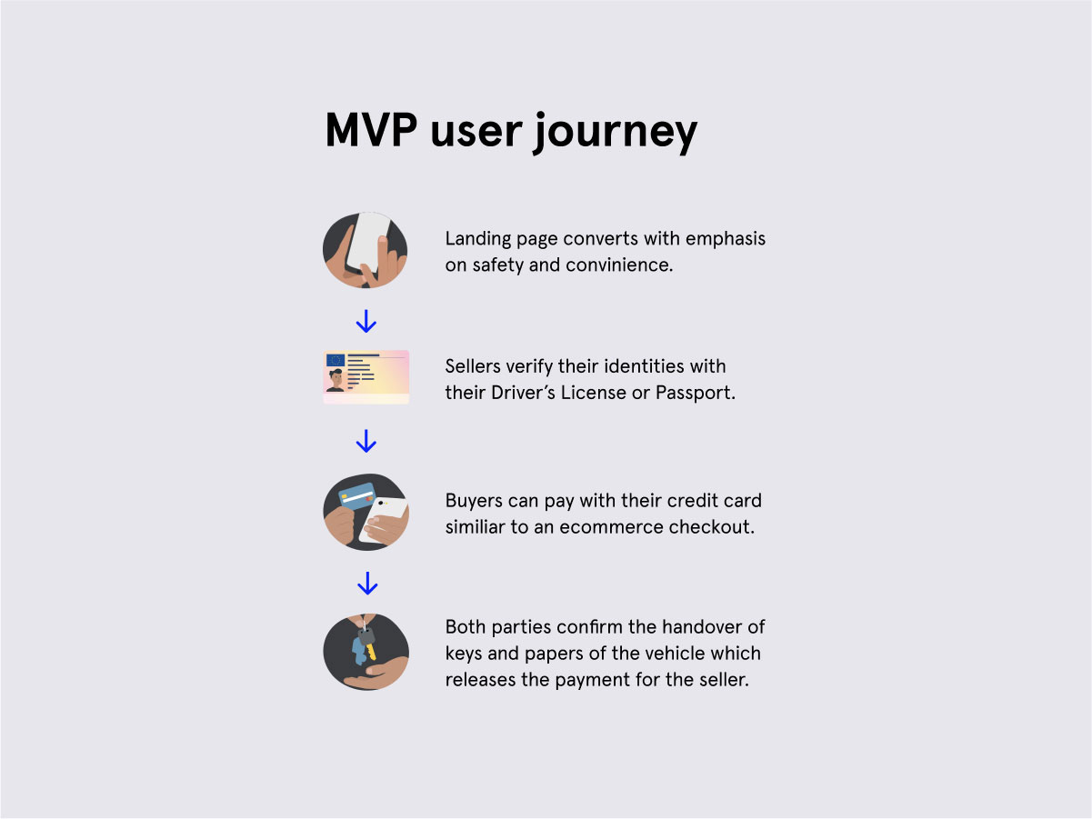
The MVP user journey focusses around the main pain points of car sellers and buyers.
Design solutions focussing on speed and safety
With many insights from the interviews we could develop an MVP which was optimized to focus on what matters to our users: a fast, digital transaction alternative which offers a safer way of selling a second-hand car. The new landing page included straightforward content above the fold, a speedy mobile-first UX/UI, a new FAQ section and highlighted Trustpilot reviews to build trust in our service.
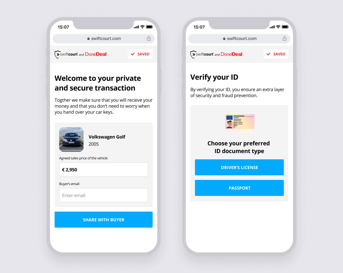
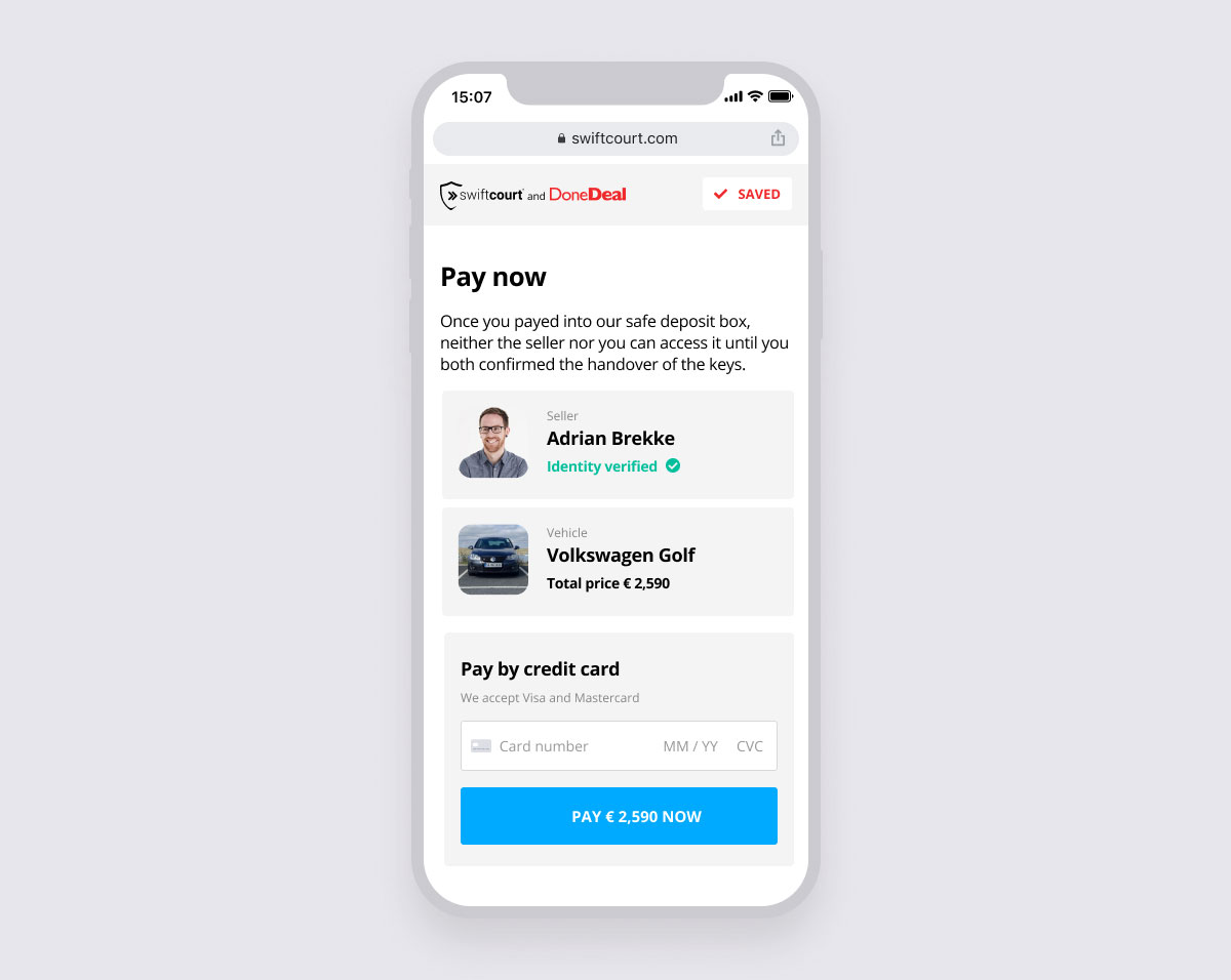
After signing up, the seller verifies their identity with passport or driver license. Afterwards the buyer is invited via email to pay for the vehicle with their credit card. The whole process takes around 15 minutes to complete.
Scroll-prototype: A new mobile-first landing page increased conversion and is further improved with A/B testing.

The seller sets up the payment for the buyer and verifies their identity.

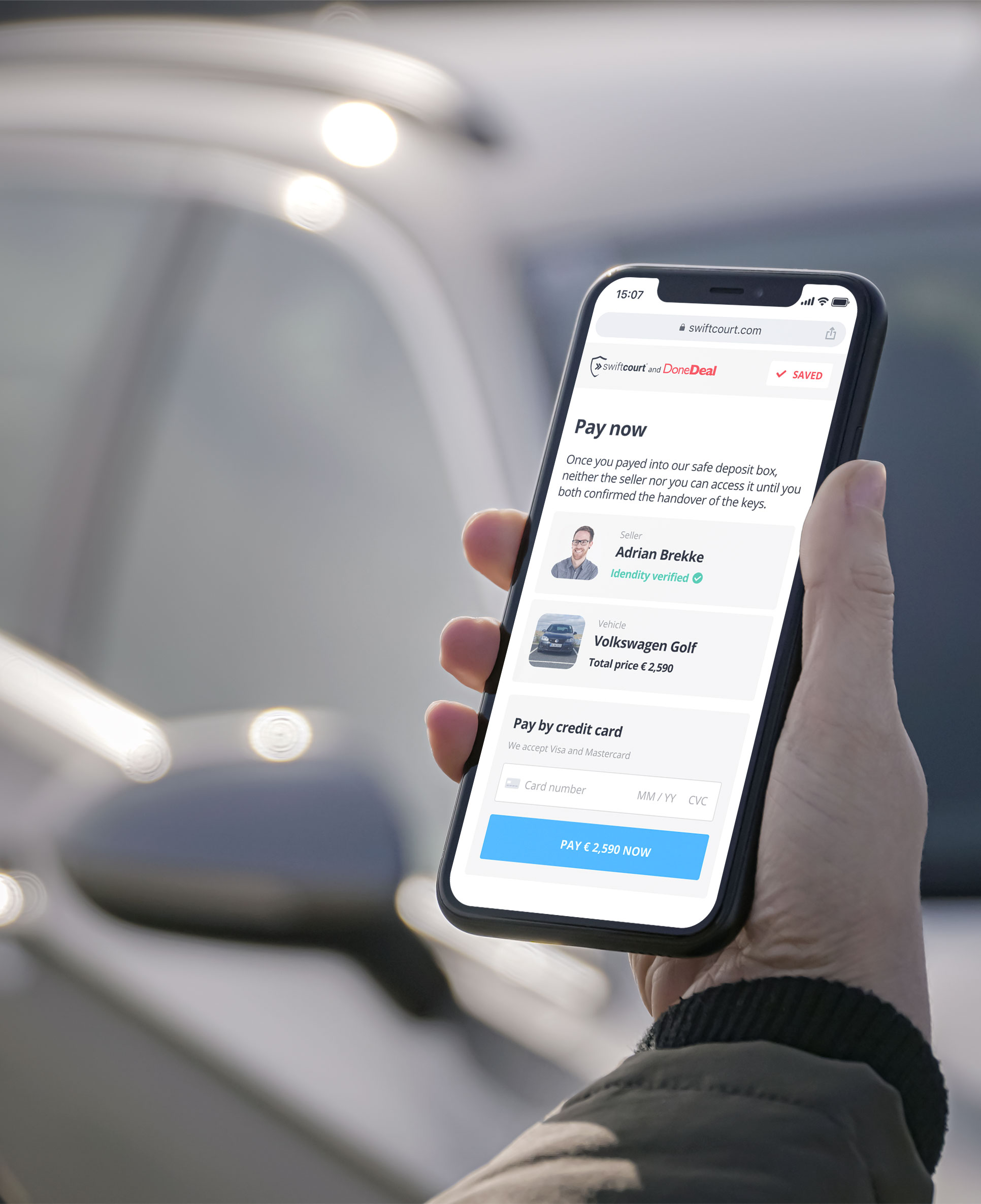
The buyer confirms the purchase and pays with their credit card.
Results
Thanks to the clear redesign strategy and time invested in research, we were finally able to enter the growth phase. Despite the restrictions of COVID19, the landing page conversion rate fundamentally increased and the MVP averaged with a high completion rate. The time users are spending in the process was reduced by half.
The next steps are A/B testing, further user interviews and to iterate on the UI of the MVP.
My experience with mixed method research and user recruiting, as well as the ability to turn insights into prototypes and code, helped the team to move forward quickly and turn a failed launch around in three months.