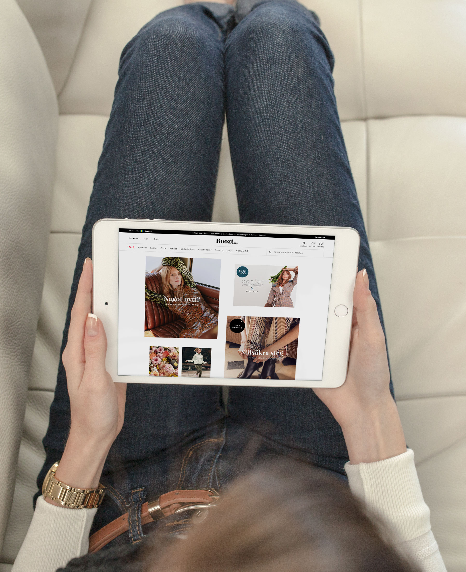
Boozt.com

A cross-platform design system to create seamless shopping experiences and enable faster development cycles. Show more

Year

2018

What I did
  • Project lead
  • Workshops
  • Prototyping
  • UI library for apps and web

The challenge

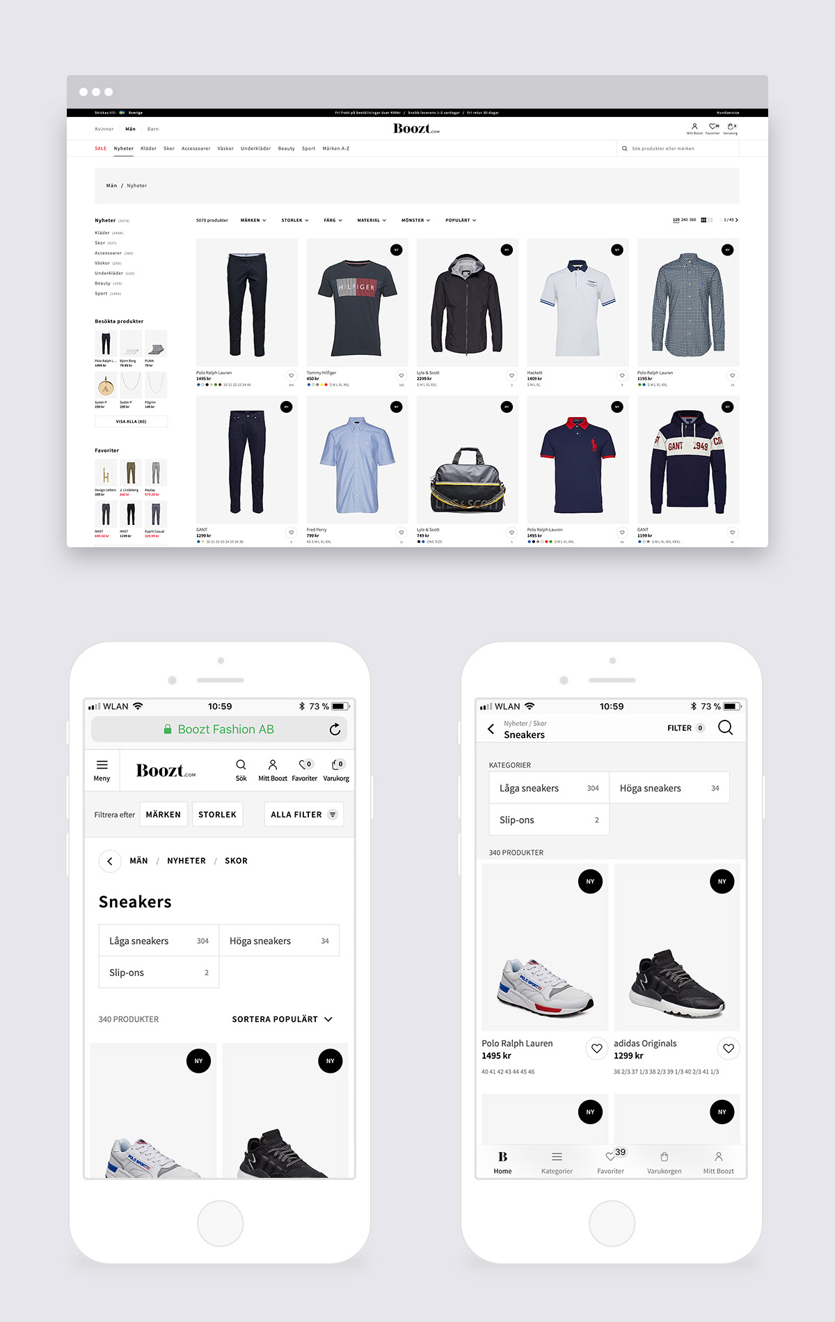
When I joined Boozt.com as their Lead Product Designer, one of the first challenges was the lack of scalable interface systems for their 1.000.000+ customers. Generations of designers and trends went through the UI, and the existing set of interface components lacked consistency and systematic thinking across the desktop, mobile and app platforms. The teams suffered from ever-changing UX/UI requirements and a large code base for the frontend components. As the company continued to grow, it was clear that the processes had to be optimized.

Approach

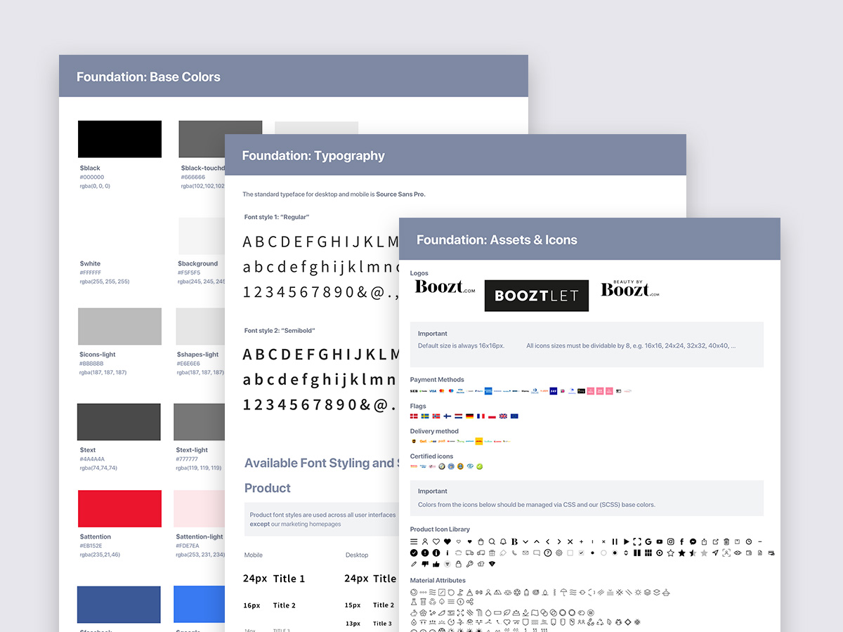
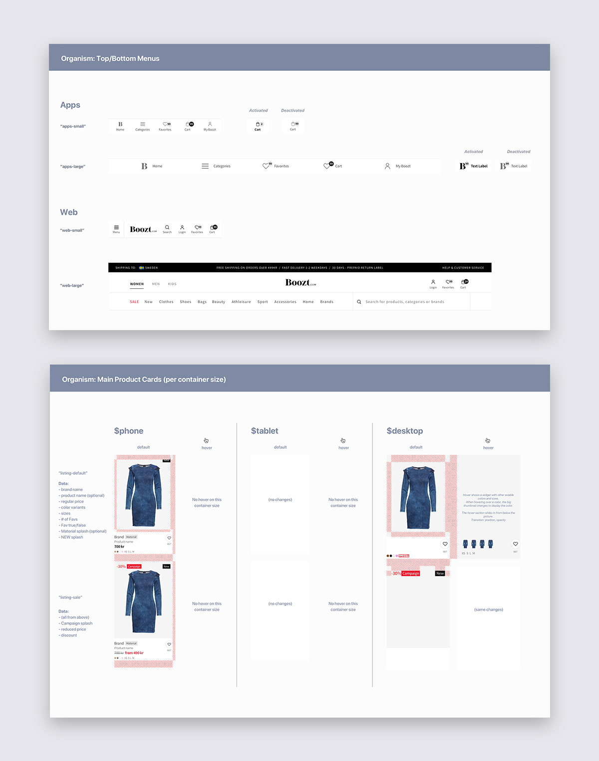
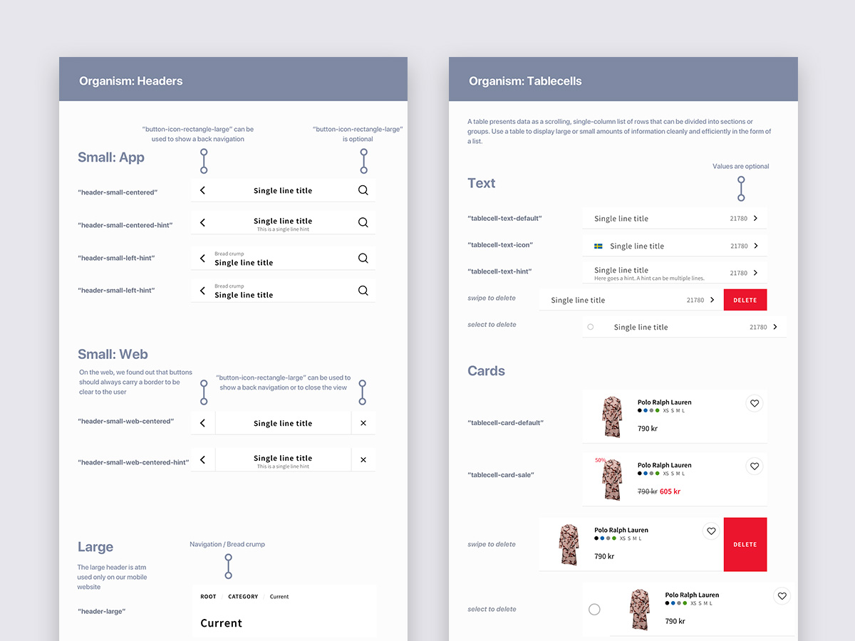
As a fashion ecommerce retailer, the system should serve the product and marketing teams by being able to include modern graphic trends but still offering a consistent UX. For the tech teams it meant that they could continue to keep the technical infrastructure split between each individual platform, but the concept of each UI component should be responsive.

  • While the foundation of the system should lay the groundwork, the component library should be separated between product and marketing components
  • Components need to adapt to web and app platforms and its unique UX patterns
  • Allow the user to complete existing tasks in fewer efforts by improving the overall UX and IA of components
  • Allow for rapid prototyping and execution by maintaining the system and assets in Sketch libraries, Zeplin and code

This case study focuses on the production aspects of a design system. For a case study about the foundational part of a design system, please check out my work on the Swiftcourt.com design system.

How I did it

  1. Decide goals together
  2. Design components for production

Decide goals together

After conducting an audit for all existing components in the desktop and mobile website, Android and iOS app, I facilitated workshops with the design teams, product managers and engineering to understand the current issues better and envision how the design system should solve them. We started by establishing basic foundation design elements like container sizes, color palettes, text styles, and iconography. While working up towards more complex components such as inputs, buttons and content cards, we created a roadmap to release and validate each component.

Design components for production

Integrating components into the live environment allowed us to gather quantitative and qualitative metrics and to iterate fast. We prototyped each component with native code to ensure that it would meet the UX patterns of its platform. For example, a content card can be removed via swiping on iOS, while Android offers a tap-and-hold option.

The unified design system is using Atomic Design Principles to allow for easy updates across components and platforms. We used Plant and React Storybook to version control the design system. We established the overall workflow and organization of the design system between the design and engineering teams, with the goal of creating branches for explorations, and conducting regular review sessions before merging.

The cross-platform design system is now an integral part of all feature development.

A shared foundation is used by marketing and product design teams.

Components are designed responsive with adoption to the desktop, mobile and app experience.

Although each component offers the same UI, users can interact with it's features tailored to their current platform.

Plant app is used by the design teams for version controlling.

Results

The design system I put in place greatly improved the UX and visual consistency, operational structure of the teams using it, and resulting in much shorter development cycles. Product managers are pleased that features are released faster, and with it the learnings and iterations. The system is evaluated by a Google Analytics behavior tracking system and part of our regular usability testing sessions.

Applying Atom Design Principles into our design system and maintaining it using Sketch shared libraries and Plant allowed our design teams to have a single source of truth for all design components. Because the system was developed across teams, each team member quickly picked up the language which made communication much easier. The design system is now the foundation of all interfaces on the desktop and mobile website, the iOS and Android app.