Swiftcourt.com
2021
What I did- Design strategy
- Project lead
- Workshops
- UI library
- Front end development

The challenge
Like many startups, Swiftcourt’s philosophy favours speed to market and operational autonomy. This creates a lot of subtly different front end designs, content structures and implementations. Differences in approach were starting to create a lot of duplication and redundancy in the front end.
The interfaces across the product use a mix of Angular, React, 3rd party CMSs and interface libraries. When I audited the engineering strategies, it became clear that with every new project the tech squad structure changed which favored deploying new code over maintaining existing one. This created ripple effects for everyone involved in the projects. While individual efforts were made previously to reduce redundancy in every team, all documentations were isolated and not shared between the teams.
Approach
The philosophy behind the design system is specifically tailored to Swiftcourt’s way of working. It’s designed to:
- Be delivered in small chunks within a squad / agile-based delivery framework to existing codebases
- Normalise and unify current styles rather than completely redesign them to minimise inconsistency during rollout
- Achieve consistency across products by using experience values, global user personas, design tokens as fundamental building blocks
- Create an intuitive Figma library that matches the codebase in structure and naming
- Provide a Notion workspace to manage and organise the project
The primary goal of the project was breaking down silos and saving effort, along the whole product design, build, and test cycle. I planned the project in key milestones, prioritising the most common foundations, perceptual and functional patterns before moving on to more complex components.
This case study outlines some of the more foundational aspects of a design system. For a case study about the component implementation of a UI library, please check out my work on the Boozt.com UI library.
How I did it
- Getting the buy-in
- Focus on the foundations
- Work with best practices
Getting the buy-in
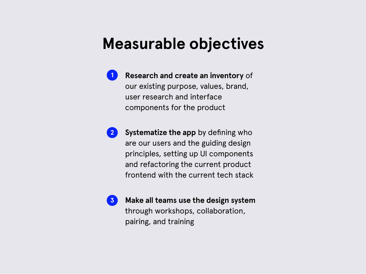
For the executive team it was important to understand how the project is beneficial to the product, when resources are scarce. The investment proposal included an overview of the solution, the team requirements and funding, as well as a straightforward process with three measurable objectives:

Focus on the foundations
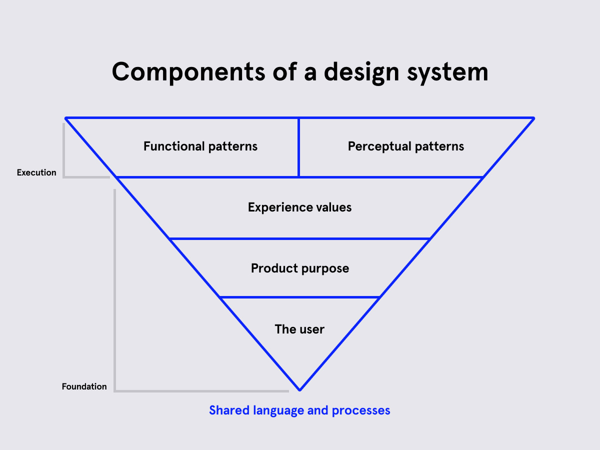
None of the team members had worked with design systems before, so I spent some time early in the project to train the foundations. A design system is based on the user and what job they want to get done. The design system helps a company to focus on the right solutions and be aligned with their users in every step of the design process. Through workshops the team established who are our users, what pain points do they care about and what values are important to them.

In a design system, everything builds on the understanding of the user.
Work with best practices
From my experience with previous UI libraries, we designed components using Atomic Design Principles to allow for easy updates across components and platforms. Since the interfaces are built with a mix of Angular, React and 3rd party systems, we established a CSS library as the first version to ship buttons, text styles, data inputs and outputs, as well as an asset library. This brought interesting challenges, e.g. SVG icons inside the CSS library are changing colors using filter-gradients to compute HEX values.
Results
In the world of startups, where the philosophy is to dare, to experiment and to move fast, a design system focussing on consistency and shared processes seem counterintuitive at first. But by bringing the attention to the needs of the users, the team understood the importance of the project. By focussing the first weeks of the project on foundations of a design system and empathy with our users, the squad was able to develop ownership and is now proudly training their peers to use the system.